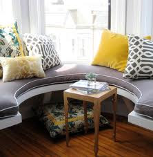
Yellow is the subject of today's blog. Yellow is very much 'on trend' in both the fashion and interiors worlds. It is a strange one, in my view. I have never been a fan of yellow. I look awful in anything yellow. I am fair skinned and freckled, two attributes that do not lend themselves to reds or yellows. Some years ago I bought a yellowy, mustardy coloured skirt from Laura Ashley. I wore it once, I think. I never dared wear it. Silly really because when I look back, with the black tights and black jumper it was worn with, it did actually look pretty funky. It was quite daring for me at the time, though. Not something I was/am known for and I think therein lies the problem with bright colours. They need to be treated with care and used appropriately. Only the bold can carry large blocks of yellow in clothing. At this point, if you are interested in yellow from the fashion perspective, I would direct you to http://www.styleguile.blogspot.com/. Beth Goodrham dedicates posts to wearing yellow and explains the rules far more professionally than I ever could.
In terms of interior design, yellow evokes feelings of warmth and happiness. A tick in the box for yellow! Like red, yellow supposedly speeds up the metabolism. The theory goes that many fast food restaurants use reds and yellows in their colour schemes as they stimulate hunger and thus make diners buy more food.
On the negative side, yellow stimulates the 'caution' sensor in our brain. It grabs the attention. Psychological studies have shown that too much yellow hurts the eye and agitates people. Brightly coloured walls cause feelings of turmoil and hostility. Dark yellow hues are thought to provoke nausea! As a result, many designers avoid using yellow in the bedroom. Hostility, turmoil and nausea are not words that one ordinarily associates with the bedroom, after all........not unless your other half has been out with the gang on a Friday night for a beer and a curry at least!!!
 Yellow, in interior designs, should really be used in moderation. Whilst I have seen some fabulous interior images with yellow completely taking over the design, it is a bold statement and a real commitment to the colour. Rather, yellow is best used as an accent colour as can be seen in the schemes here.
Choosing the right shade of yellow can be tricky. A very bright yellow is more suited to a bright, light space whereas, if, like me, your rooms are slightly dark, then a more mustardy tone is better suited. The pic below, many of you will recognise as being my front room. The walls are painted in Farrow and Ball's Stony Ground. This is quite a definite colour, not dark, but 'definite'. As the sun (when it is around!) moves to the back of my house, this room becomes quite dull. I chop and change my view about whether dark rooms should be painted in light colours to give the illusion of light...or whether one should just work with nature and go with a darker colour. Farrow and Ball suggest the latter is the way to go and I have to say that I agree, having painted this room more times than I care to mention!
The idea for yellow tones as an accent came from the picture above the sofa. Citrus shades work well with earthy tones in that they liven what could otherwise be a flat scheme and I think it works here. I've picked up the yellow in the picture and accessorised with a sulphur coloured cushion from John Lewis (£35). (My husband is not keen. He says it reminds him of a hat his Grandmother used to wear!) The navy velvet cushions are also John Lewis and the Ikat design 'Kamasi' cushion covers are from Oka (£39). Blues and yellows, opposite each other on the colour wheel, compliment each other nicely.
I'm on the look out for another cushion for the other sofa now. Same accent colour again. This is just enough yellow for me. Enough that I can re visit if I get agitated, hostile or nauseous at any point!
Anyway. I hope this gives you some confidence to give yellow a go.


I'm loving a pop of yellow these days too! A nice bold piece of yellow is so bright and happy :)
ReplyDeleteI agree, Patty. I love to see yellow tulips and daffs at this time of year too. A happy, optimistic colour.
ReplyDelete