Thursday 4 December 2014

My Next-ra special Christmas wishlist!

As with many parents of young children at this time of year, I always think it's a nice touch to sit down with the littles and get them to write a letter to Father Christmas.  


Now, Father Christmas always replies...though he has somewhat made a rod for his  own back I feel,  in so far as he always hand writes the reply in a style very reminiscent of the writing in JRR Tolkien's 'Letters From Father Christmas'!  


It is mere coincidence that we have that book!  I can recommend it.
A friend pointed out that, on request, Father Christmas will type a reply!  Wish I'd known that 3 years ago!
Neither of my two have any particular requests this year. Phew. The 'requests' have tended to be costly and often end in disappointment...particularly with the 10 year old. Mobile Phone? No! My own iPad? No! Horse? No! Alpaca? Errr. No! Ad infinitum. 
No requests means a letter to Santa asking him to use his imagination. Fantastic. I know Santa enjoys shopping for little, inexpensive items that will bring as much pleasure as all of the afore mentioned budget busters!

 
With that job done and dusted I was approached by Next to compile my Nextmas Wishlist top 10. How could I refuse? I put on Sinatra 'The Ultimate Christmas' and off I wandered in to fantasy Christmas wish list land!

So. Here goes. My list, as you might expect, is compiled from the Home and Furniture range. In no particular order, my Nextmas Wishlist top 10 is as follows....and I will be writing to Father Christmas in due course!
                     
            1. Classic Velvet silver Westcot bedstead.....for elegance in the bedroom.
            2. Textured panel cotton bed set......who can resist crisp, white bedlinen? 
            3. Brooklyn TV unit......contemporary, smart yet functional. The perfect balance.
            4. 7ft Grove Pine Christmas tree.......for a real look without the dropping needles.
            5. Silver luxury fur throw........for cosy cuddles by the fire.
            6. Large Curve Arm floor lamp.....stylish lighting in on trend grey.
            7. White Geranium and Jasmine fragrance 3 wick candle.....Mmmm. The scent....
            8. Pewter beaded mirror....metallics are bang on trend.
            9. 200 LED bright white fairy lights.....never have enough of these!
           10. Silver Chrysanthemum wallpaper.......perfect for a feature wall.

Follow this link to see all of the above and many, many more delicious, stylish, festive products that could so easily have made my top 10.
                                                     www.next.co.uk

Have a very merry Christmas and a happy and healthy 2015. xxx


Tuesday 2 December 2014

Batman! You've been framed...by eFrame.

We have recently tackled the children's bedrooms which was a relatively simple task. Carpets are being replaced later this month, but the rooms are stripped, lined and painted (white).

Both children chose blinds for their windows. This is not a curtain household, as you may have gathered. The five year old chose a lime green blind and the ten year old a raspberry pink blind. She is revisiting pink at the age of ten, having abandoned it for three or four years in favour of less 'girlie' colours.

Five year old then chose to replace his Mr Men framed poster with  more 'grown up' subjects, namely, Batman and his other superhero friends. I was happy to consider anything that wasn't Ninja Turtles! I actually think the old superhero posters have a strong design element....great colours. Captain America graces the playroom wall.....a particular favourite of the 'adult boy' in the house!

The Batman poster came from www.allposters.co.uk and I was lucky enough to have been approached by eFrame offering me a custom made frame at a discounted cost.  (Click on the link below to take you to their site.)

As this was for my son's superhero poster and not an inherited work of art, I chose a simple black reflective lacquer frame which lets the poster do the talking.

This photograph doesn't really do the framing justice. The frame perfectly suits the poster!

The eFrame service was excellent, I have to say. I asked a number of questions prior to ordering and the response was prompt and useful.This frame cost just under £50. Yes. You could go to Ikea and spend £20, but in actual fact I couldn't get the size required and also the general quality of construction (no gaping joints at corners...), backing and fixings is well worth the extra. The frame arrived well packaged and very quickly.  I was slightly surprised that the frame did not come with glass rather than plexi glass...but, again, eFrame came back to me straight away with a comprehensive response.

The frames come with what is called Clarity+ Glazing - Also known as plexi glass. It's 1.5mm thick and is sent out with 95% of eFrame frames.
 
This glazing has many advantages over and above traditional glass and actually costs  more money. eFrame swallow the additional cost as a company though because this is what they prefer the product to be shipped with.
 
They deal with many Top London Galleries and most of them choose to take this glazing over and above the 2mm float glass option (available on custom frames below 600mm x 600mm in size). Even the world famous auction house Christies takes this glazing option! I'm in good company then!
 
Not only do eFrame offer a comprehensive choice of custom and ready made frames but their site also has a 'design your own' section where you can upload a photo of your picture and then design your own frame and mount and see how it will look prior to ordering. A really useful tool. 


For more information on eFrame and for some great pointers in what to consider when framing pictures follow the links below.
 

 https://blog.etsy.com/uk/2014/10/29/how-to-frame-a-picture

Saturday 29 November 2014

How much more mustard can a house take? I hope you are reading Jonathan Adler....!

I'm starting to ask myself, " when is enough enough?"

I'm sure my family will start asking before too long.

The colour mustard seems to have taken over my very being! As if a wall and cushions weren't enough I'm now planning a bedroom scheme and will shoe horn some mustard in there if it kills me! I blame a good friend, whom, on a recent trip to New York, bought me
these gorgeous Michael Aram napkins. Not a great pic, but, trust me, they are beauties. Fuelled my mustard love affair!


As we are nearing the end of our own mammoth house make-over, give or take another 3 rooms (!!), I am slowly losing a little enthusiasm....energy I am re-directing into guiding others through their own house make-overs...but more of that in posts to come.

For our own bedroom I have scaled down my early enthusiasm and have started off as George Clarke would, by slapping crisp, white paint on every wall. I rather like it. No doubt at a later stage I will add some colour, it'll be too hard to resist, but for now, the white stays and I'm turning to bedding as a way of introducing some bold design.

This, I am finding frustrating. Flicking through my trusted magazines, I pulled out a couple of schemes which immediately appealed.     


I am instantly drawn to geometric prints and chevron in design. It's very 'definite' and that, for me, works perfectly when looking at more contemporary styling. Layering colours, pattern and fabrics help to soften what, alone, can be too strong a statement.
 
So the backdrop to any soft furnishings are white walls and a very plain, straightforward navy blue roller blind at the window purchased from www.blinds-2go.co.uk.  I will post a photo in due course, but the room is currently in a state of chaos, with bed and wardrobe dumped in the centre of the room whilst we plough on with the emulsion.
 
I excitedly logged on to the computer having decided I would try and find a throw, blanket or bedspread in a nice, mustard tone and a second bedspread in navy and white chevron. Oh dear. My excitement was short lived. I quite like the Tweedmill fishbone blanket below, and reasonable at around £40-£50. Apparently BHS do a mustard throw but not only could I only copy this tiny image, as seen below, but infuriatingly, when I tried to get on to their site, a message popped up saying the site had crashed due to Black Friday...which seems to have morphed in to Black Saturday! The sooner the whole sorry business is over and done with, the better!


Then on to the zig zag or chevron idea. Even worse! The only one I found was a fleece blanket below from www.cafepress.co.uk at £35. May well be ok for a pop of zig zag, but fleece was not really what I wanted. 
 
What I really hanker after is a Jonathan Adler Alpaca zig zag throw, but cant quite reach the £295 price tag....but if you are reading, Jonathan, you are one of my design heroes and I would love to have one of your beautiful throws draped across my bed! I'm not too proud to grovel!
 
In the meantime, if any readers can point me in the direction of a cost effective alternative, I would love to hear from you.


Saturday 1 November 2014

A splash of colour courtesy of Henri Matisse and Harold e Maude!


So....finishing touches include a couple of framed posters to add a little colour and interest to a room.
I struck a deal with my husband that I would choose one and he the other. Once I had steered him away from The Exorcist promo posters and Star Wars he decided on Harold and Maude. Phew! My choice was the Henri Matisse print, chosen particularly for its bold injection of colour. Excuse the quality of the pictures. I used my phone as my camera lens has been (little fingers, me thinks..) struck down by a mysterious ailment. I need a new camera in short! 


Figuring out what kind of artwork you like can be difficult. I tend to go for more casual artwork....tourism posters from cities visited, gallery advertising posters that sort of thing. I like the fact that the subjects have some personal meaning but also they tend to be quite bold and structural in style which I like. I also like architectural prints that also satisfy my like of a more structured, sharp style. The third picture, sat on the desk, is from a little art shop somewhere in deepest Derbyshire and is, I think, based on a Rembrandt, but in actual fact, when I googled the original, it looks nothing like this one! The original would have been much nicer, but Rembrandt prices are just that bit too much of a stretch for us! Quite like it all the same.
 
If you change your décor regularly (as I do) then buy more cost effective pieces and theme them around the colour palette. The two posters you see in the above scheme are from All Posters www.allposters.co.uk and cost a few pounds so can easily be changed at any point should I desire! They have loads of choice and regularly offer price promotions.
 
Location can be the deciding factor. You may prefer more calming artwork in the bedroom, more dramatic in the dining room and more relaxed in the living room or you may feel rules are there to be broken!
 
I've tried to link the prints chosen to the scheme, picking out particular colours and sticking to a more modern feel. However, you might have a piece of valuable artwork that may be a family heirloom or a piece you have invested in that may require the scheme to work around it rather than the other way round. If so, try positioning the artwork on different walls or alter the wall colour or surrounding furniture in order to accommodate the art.
 
Plain and/or white walls tend to be the best backdrop for art and this applies in general to furniture and art too....the less is more principal, especially if the picture is quite detailed or busy. Make it the star of the show.
 
For positioning on the wall, with average ceiling heights, pictures look best at eye level and if more than one, grouped to balance the width and height of the wall. For a more relaxed, loft like look, lean pictures on the floor against a wall. This works particularly well in bedrooms I think.


Above all, the artwork in your home should make you smile, relax, remember or wonder. 


Monday 13 October 2014

Blue/black. Love it or loathe it?

We've just about finished the front room now bar the odd picture or two.

I think I like it.....

I argued with myself over colour along the fireplace wall. Too dark? Wrong shade all together?

The thing is, sometimes you just have to go for it. It's only a painted wall after all. I can change it relatively inexpensively if I decide it's not right. At the moment, I think it is.

I'll start with the 'before' picture taken from the agent's details. Very brown!


Fortunately this room is triple aspect and therefore benefits from lots of natural light. As a result we could afford to introduce some dark, bold colour. Sticking with a bit of a theme....though I try to avoid too much 'theming' I introduced some citrus zing via cushions and will in time bring in some further colour with pictures.


I didn't really want white walls everywhere, despite having originally planned to have white walls everywhere! We tested lots of wall colours including purples and greens but eventually plumped for Farrow and Ball 'Railings' along the chimney breast wall. Though this looks black on this photo, it is actually an intense blue. I don't really go for blue and black together, but on this occasion it actually helps that the wood burner is black as it clearly shows the blue in the wall if that makes sense.  

 
I don't know if any of you have seen that new Interior Designer challenge show that has been on recently, where amateur designers are let loose on members of the public's homes...presented by the woman that was a dealer on 4 Rooms? Anyway. Last week, one of the rooms featured a black wall and one of my friends happened to comment asking why anyone would paint a wall black?
 
Given that the room was quite small and quite traditional in style, I would agree. Black was completely wrong. Any kind of feature wall in a dark or bold print needs space and preferably light to sit comfortably. I'm not sure where they found these amateur designers, but I would have cried had they done any of the things they did on my house!
 
We haven't been out and bought new furniture for this room and so I have mixed a few more traditional items from the cottage with some slightly more contemporary touches. Margo, the cat, has a new cushion!
 
Wood burner - Charnwood www.charnwood.com
Stove and hearth fitting - www.eglow.org
Paint - Farrow and Ball 'Railings' - www.farrow-ball.com
Sofas - Ikea
Cushions - John Lewis and Oka www.okadirect.com
Flooring - engineered, oiled oak.


Saturday 30 August 2014

Trend follower, trend setter, somewhere in between....or couldn't give a flying....?

I've been having a look at what is trending, or will be, in the world of interior design. For the record, I really don't like the expression 'on trend'. To my mind, it's a commercial term designed to make us think that if we buy in to the idea that something is 'on trend' that we will immediately rush out and buy it or grab the idea and plaster it around our houses. If something is 'on trend' you can bet your bottom dollar it will be 'off trend' a month or so later, if it isn't already by the time you've parted with your cash.
My point is, is it really that important to be on trend?

I listened to a presentation recently by some industry insiders...journalists and interior stylists....who debated the very subject. The conclusion, not surprisingly, was that taste is a very personal thing. Stylists (interiors) will look to the seasons' trends when advising clients, probably to avoid being labelled as 'so last season' by others in the industry. For commercial reasons, stylists need to be 'on trend' as they often work for the trend setters. A good stylist, however, will take in to account a clients likes and dislikes and try and marry this up with current trends and what they know will work.

You might be like me. I rarely pay too much attention to what's trending in interior décor. I read loads of magazines and look at what's happening, so probably know what is being pushed in my direction, but I like what I like whether it is bang on trend or not. If it is, it tends to be accidental! Same with my wardrobe. I'm definitely not a trend setter (or a trend follower) in this arena...

I like Pippa Jameson's view that someone is truly trendy/fashionable if they follow their own style with confidence irrespective of the trend setters.

 
By the time something hits the high street and prior to that, the press, it is almost a 'has been'. An example would be animal motifs on cushions and soft furnishings. Massive the last couple of years with foxes, owls, birds and butterflies everywhere. By the time we've all bought an owl cushion, the industry has moved on!

So, what's trending going forward then? Well...the good news is there are a couple of trends that are considered 'enduring' in that they will always pop up in some form or other but just be given a different name or description! Monochrome being the first. I wonder what it will be called this time?


This is a particular favourite of mine. I love the structure of monochrome schemes and they are versatile in that you can add colour at any point to soften or add a bit of pizazz and alter the balance of black or dark and light.

Pastels also feature. Great for period properties....bit more difficult in a modern property but a bit of pastel can work well against monochrome...a soft pink or a minty green for example.


Our love of grey continues.  Look more to the blues for inspiration. Obviously this encompasses stronger hues and pastels. One of my favourites is Railings. I love the depth with a hint of blue. Probably my colour of choice for our living room wall. The deep, rich colours work well with white and with metallic.

So, if you follow trends and like any of the above then good on you. If, like me, you follow your own sense of style, then good on you too! If you love your owl cushion, like I like my polar white, Formica work surface (apparently Formica is making a massive comeback!) then keep loving it. Well. For the record, I love it, trendy or not!

Friday 29 August 2014

Relishing updating a fireplace and putting off looking at TV storage!

As you know, our next project is the living room. Here's a quick shot of how it looked when we viewed the property. Each to their own...but not my taste. Very brown. The flooring change half way through the room marks the point where an extension was added and the owners decided to carpet the extension section. Anyway. Plenty of scope for improvement with lots of light from double doors and 2 additional windows and views over the garden. So far we  removed all of the shelving and stripped and lined all the walls ready for painting. We've removed all of the plastic skirting and will be replacing with wood. Nothing fancy...just standard skirting. The wood floor we have in the kitchen (see previous posts) is being continued through into this room.


The fireplace is opposite the double doors and featured a dark wood reproduction fire surround (fire wood!), brown tiles and a gas fire (removed). The plan is to create a wider opening and install a wood burner....partly because we've had a few trees cut down and therefore have a plentiful supply of logs...and partly because we love the heat generated by wood burners. The look will be plain and simple. 
 
The table on view is a relic of our previous cottage existence and is waiting to go to new owner. The tool kit belongs to the 5 year old who intends on helping with the tile and hearth removal apparently...
 
The internal doors to study and hall will also be changed at some point...but that will have to wait for now. As with other rooms, in the short term, we have, at least, updated the door handles to a more contemporary style. Small changes at a time are sometimes necessary.


I've yet to decide on a scheme for this room but I've been trawling the mags and looking at so many houses...checking Pinterest and generally having a good nosey whenever I'm out! 
 
Below are a couple of the rooms I like and from which I am thinking of taking my inspiration. This to me, is quite a grown up look, but I'll only be stealing elements. Splashes of vibrant colour play a part, of course. I quite like the burst of pink from the coffee table but I'm not sure how that will go down with the boys in the house...
 
The plan so far is to paint the fireplace wall (the full width of the room) in an off black colour. Quite dramatic...and very dark....but as the room is spacious and gets a fair amount of natural light, I think it can take it. The remaining walls will be white. I considered a paper for the wall rather than paint, but my problem with paper is I tend to fall head over heals for a paper and love it for a while but then grow increasingly tired when I spot something else or feel the need to paint over it. My husband pointed out, quite rightly, it just becomes expensive lining paper! Experience has taught me that paper is not the way to go for me on this occasion.
 
Working with a dark colour relies on finding colours via accessories/artwork to provide, literally, some light to counteract the depth. At the same time, with a dark colour only on one wall, the white walls will need some contrast in order to balance the room and not leave it looking like a game of two halves.
 
I was going to talk TV storage units (yuk!).....but I can't quite bring myself to broach the subject yet. This will be where I struggle massively but am not allowed to chuck out the TV! I'm hoping I will stumble across an inexpensive piece of interesting furniture that can double up as a TV stand/table.
 

We're also working on a small playroom just off the dining kitchen. So far, this has been lined and painted brilliant white. Again, this was a dark, brown nothing kind of room. As it's probably going to end up as the toy graveyard, we are keeping it predominantly white and have purchased some retro comic posters just to add a bit of interest and colour. These were sale purchases from online supplier www.allposters.co.uk


And finally. If you're a fan of colour, check out Will Taylor's blog, www.brightbazaarblog.com
I love it! I read about Will in a magazine. He takes great pictures and uses colour really well. I can see I'll be tuning in to this site on a regular basis!  
 

Saturday 23 August 2014

Colourful bargain purchase of the week from Waitrose!

After an elongated rest from the world of interiors I have kick started the next phase with a really exciting purchase! (said sarcastically...).

We've just ended a really lovely week down in Hampshire in the delightful New Forest. I'm not paid by the Hampshire Tourist Board, but it really is lovely down there. A great mix of forest walks and just a hop, skip and a jump to the beach. The smalls loved it. My daughter is obsessed with horses and therefore when we came across 'free range' donkeys happily plodding along Beaulieu high street her eyes nearly popped out of her head! That was just the start. Our friends live in the New Forest and, for daughter, opening the front door and looking across the road at New Forest ponies grazing right in front of you was like seventh heaven! Son was less impressed with 4 legged friends but loved hooking up with his 2 legged little girl pal. Both 5 years old, they already resemble an old married couple. I think our families would all agree that wifey wears the trousers in the relationship...mostly by default as my son becomes totally subservient in our friends' daughter's company! We need to borrow her on a regular basis!

Anyway. As usual, I digress. Wifey's (name for purpose of this blog) mum and grandma and I share common interests, one being going out for lunch, but choosing a route allowing us to wander in and out of housey/interior and clothes shops! But it was actually a supermarket find that made me part with my money on this occasion....though I do have a few non-purchase regrets already.

Wifey's mum had previously purchased some colourful plastic cups from Waitrose picnic range and I eyed them up immediately and made it my (sad) mission to track some down. Anyway. Here they are. Lovely jewel colours and completely practical for outdoor use (or, indeed, indoor use for children) and in the sale at £2.50 for a box of 4. So much so, I bought 4 boxes on the basis that they would make ideal children's party cups as alternative to the disposable variety. Not a show stopping purchase but a pleasing one all the same.

Over the coming weeks we are transforming our living room with new fireplace, flooring and décor so stay tuned!


Monday 26 May 2014

A few finishing touches

 
With a few finishing touches we final have our new, fully functioning kitchen. Hoorah!
 
 
Pretty chuffed with the result and in at just under 20k, including building work (knocking 3 rooms into one), kitchen cabinets (incl. fitting and painting) plumbing, electrics, new appliances, engineered, oiled wood flooring and extras such as light fittings. All in all, quite a good result for the budget.


A few mementos of our travels. I painted the frames with Farrow and Balls 'Railings' to contrast the mustard walls and to frames the blues in the picture.


For the first time in years I can actually see exactly what I have in my cupboards! 2 larder cupboards are amongst my favourite elements. May have to do a slightly bigger food shop to fill one though!


Source book.....
 
Kitchen cabinetry  www.allwood-kitchens.co.uk
 
Building, plumbing and electrics - Trident Heating & Electrics Ltd/Snap Developments
 
Appliances - Bosch inducton hob, Bosch cooker hood, AEG built in double oven, Rangemaster undercounter freezer, Hotpoint larder fridge, Zanussi dishwasher, Blanco double sink and Franke Basel tap. All www.longeatonappliances.co.uk
 
 
Paint - www.littlegreene.com (French Grey Dark) from www.countryhomeinteriors.co.uk, www.habitat.co.uk (Mustard)


Saturday 17 May 2014

I love English mustard. Now it's even on the walls!

Progress in the kitchen department!

From this (November)....


To this......a couple of weeks after we moved in!


To this......

Still a bit of a way to go but we are nearly there. Another week and we will be able to actually start properly using the kitchen/family room.

The kitchen units need their coat of Little Greene's French Grey Dark and we've added the fabulously uplifting yet warm mustard colour by Habitat on the end wall.

For anybody that loves spicy yellows I would urge you to try a tester of Mustard. I was a little apprehensive, not being a massive fan of any member of the yellow family, and I worried that it would not look as good as the magazine photo I referred to in my last post.

I love mustard.....in a cheese sandwich, on ham, with anything and everything to be honest....but on the walls?

You know how it is. It normally happens to me with outfits. I see a great outfit, picture myself in it in my head and then when I actually try it on I'm crushingly disappointed by how I actually look in it. My worry was mustard on my wall would disappoint in the same way.

But no! I love it. This photo was taken at dusk and it looks as good, if not better, as day light fades. So much so, I'm painting a little more. We're going to paint the wall with double doors out on to the garden with the same colour. This will also tie the kitchen/dining and seating areas together. All other walls are brilliant white.


I hope the sun is shining where you are.

Tuesday 29 April 2014

Progress in the kitchen department

This is going to be a short, sharp blog as I am working between coffee catch ups, school run and more coffee catch ups!

I've had what might be described as an epiphany on the kitchen front. As anyone who knows me and has spoken to me of late will confirm, I have been backwards and forwards again and again with the decision of what colour to have the new kitchen units painted! As ever, I have had 3am arguments with myself on what to do. We have tested endless pots of paint and not one has quite left me with that 'Yes. That's the one' moment.

What has actually happened, and what often happens with me and the decision making process, is that I have just about come full circle and ended up with the colour that I started out with....just a little darker.

So. To the plan.


The kitchen cabinets have been arriving. Progress. The kitchen has been filled with a lovely wood smell. I about collapsed when, in the absence of any other men other than the joiner, I had to help him lug a couple of larder cabinets from the van in to the kitchen. Obviously I had a point to prove, that a wimpy looking woman could indeed manage such a task. The fact that my arms were wobbling like jelly as a result and I nearly dropped his cup of coffee kind of gave the game away....but at least I didn't have to call on a neighbour!

We are having the cabinets painted in Little Greene's French Grey Dark. The work surface is white and the floor, light oak. The kitchen below is French Grey Dark, to show an example.


My original thought had been to paint the cabinets a very pale grey. I then decided this looked boring next to the floor and moved on to lime-ish green colour, via yellows. I then decided that looked a bit too bright and moved on to slate blue/grey. That looked too dark so I moved back, via a few other obviously wrong choices, to grey. French Grey Dark gives that good balance of neutral but strong enough to contrast the white work surface. It is also very definitely grey. Farrow and Ball's French Grey, for example, has a definite green tint to it.
 
My other reservation was that from the start I had wanted to avoid the end result being too traditional looking (hence my brief foray in to the world of limes and yellows). With this in mind I spotted this pic in a magazine and  had that moment of knowing exactly what I was going to do.
 
 
Just off picture (of the new cabinets above), but at this near end, we have a utility room and the idea is to paint the wall between the kitchen and utility in a shade similar to the above (Mustard by Habitat), if not the exact colour above. The door in to the kitchen is at the opposite end of the room so you will see this flash of colour as you come into the kitchen. Our table and dining chairs are similar to the ones on the picture and therefore the overall effect should be a good balance of modern and classic with all other walls , running in to the dining/tv area, painted white. Greys and citrus colours do generally work well together.

We are still managing to stick to a really strict budget. The windows in our kitchen/family room are pretty standard UPVC ones (already in before we bought the house) with pretty corny sills.....but they have scrubbed up quite well and frankly, we can't afford to replace them. They are white and in perfectly good working order. They are staying.

My long suffering hubby will sigh with relief that the tester pot shopping is over for now.....provided that the Habitat colour is not too mustardy.....................

Don't sit back yet, darling!


Wednesday 16 April 2014

Home improvements update!

Here is a little update on all that has been going on in our new house.

We moved in in November last year and it has been non stop since then!  We've achieved a fair amount but there is still loads to do! It is proving to be a labour of love as although the house really needed (needs) some serious tender loving care and was seriously challenged in so many ways, not least of all its kerb appeal...or lack of, we absolutely love the house and its location.

So. What have we done so far?

Bathrooms....

From this...................................................................................to this...in the main bathroom.


An en suite with shower...... 


A downstairs loo....


 And the main work in progress.....but already looking a million times better....

The kitchen!

Before..................


Dismantling.....utilising any labour we could find!


Progress to date....  


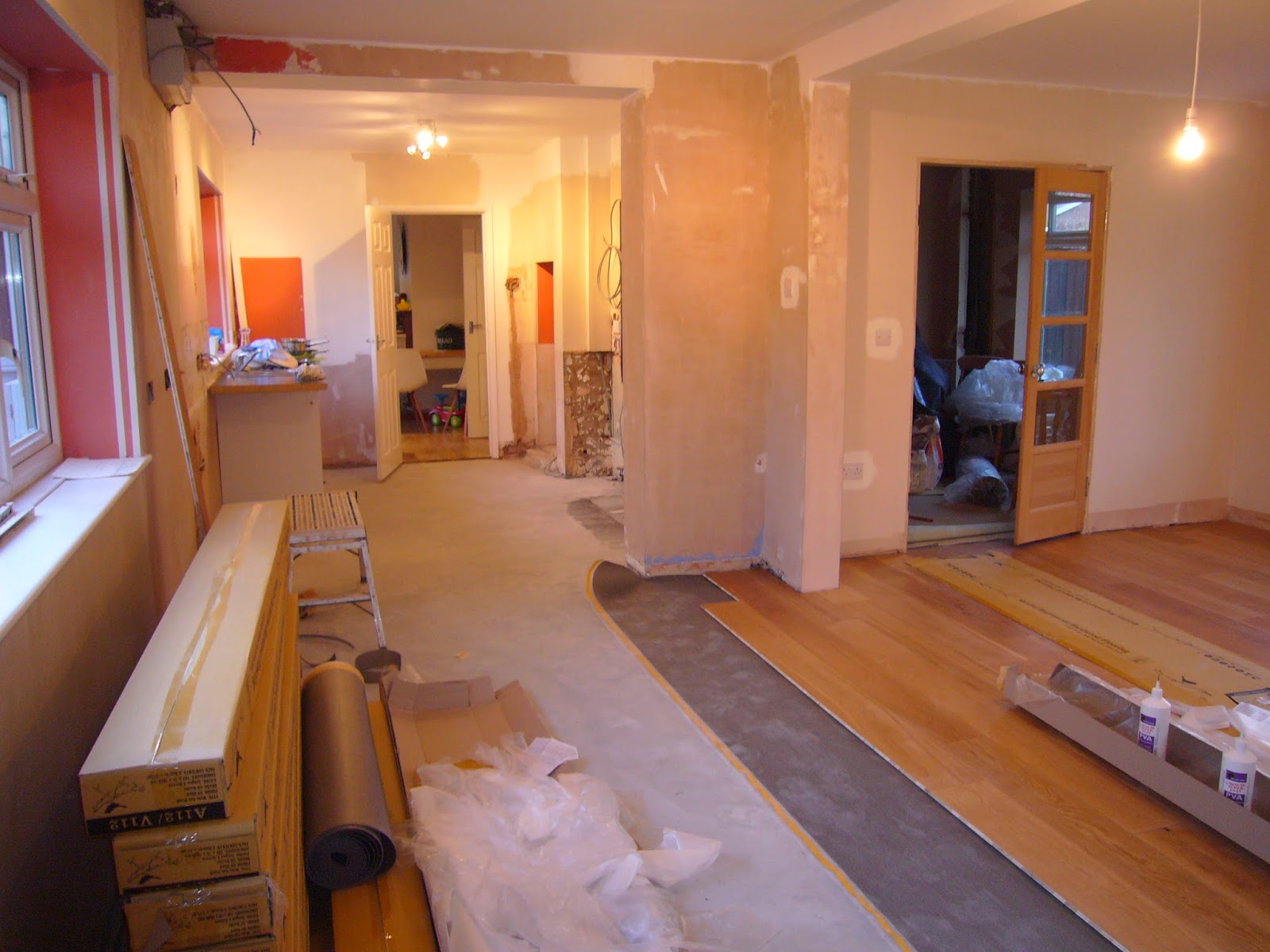
We have had many a sleepless night deliberating on floor choice for the kitchen. I have read and re read reports on all options of flooring for kitchens and have spoken to more joiners and sales people than I wish to remember and have concluded what I always conclude....that there is virtually no consensus of opinion on this subject which is really helpful!

In the end we have gone for engineered wood in a medium to lightish oak which we intend to run throughout the whole of the down floor...once we have won the lottery or sacrificed a few more holidays and meals out and lived on beans on toast for a while!

Is wood a good choice for the kitchen? Well. I've again concluded that as long as you look after it (wipe up spills etc. which I think most people would tend to do anyway?!) then it is perfectly fine in the kitchen. In the event of plumbing disasters, are they not disasters no matter what is on the floor?

We chose wood as we wanted something with a slightly softer look than tiles and also our budget would not run to under floor heating and therefore tiles would have felt a little colder under foot.

I have to confess that when the wood turned up, I had a horrible feeling in the pit of my stomach...thinking that I had made the wrong choice and that the tone of the wood was not quite right. I did not fess up to my husband at this point! It is such a difficult thing to decide and is such a significant expense that getting it wrong is painful and had it been wrong, may have resulted in my disappearing under the boards!

Thankfully, now a good area has been laid, my fears have subsided and we love it. It has very few knots which was my fear with wood. We wanted it to look quite modern and clean so that was a huge sigh of relief!! We went for an oiled finish. On this, there did seem to be a consensus of opinion. Oiled wood is easier to repair than lacquered. The downside, if you choose to see it as such, is that you have to re oil the boards every 18 months to 2 years.

So we are half way there with the kitchen. The floor should be finished in the next day or so and the kitchen fitters start after Easter.

Have a great Easter!