Tuesday, 13 October 2015

Gorilla Glue UK

I'm always happy to use Lottie's Interiors to look at different products.....if it's something I would use myself.

Today's post is one such product. I particularly like the broken pot solution as I for one am a tad lazy when it comes to bringing pots in to prevent frost damage. More often than not, my favourite pots end up in pieces.

I'm just wondering if it's strong enough to mend my daughter's broken heart on realising after taking her to One Direction's final tour concert on Sunday that Harry and Co would be going their separate ways very soon! Such a shame. Love them or loathe them.....it really was a fantastic show.

Here's a possible solution! I'll hand over to Gorilla Glue to explain..

See UK Gorilla Glue for more info and stockists in your area.
 
Guest Post – Repair Not Replace and save money! – by Gorilla Glue UK.

A broken plant pot will find its way into everyone’s garden at some point and is something that we often can’t control due to the uncertainly of the elements! We are fast becoming a society that finds it all too easy to go out and spend money buying another item rather than using DIY skills to repair like the generations before would have done.

Here is a simple solution for fixing your broken plant pots. We’ve chosen to use Gorilla Glue as once it has cured it can stand up to intense heat or extreme cold and is also 100% waterproof, so ideal for fixing items that find themselves at home outdoors.

Step One: Damp It

In order to activate Gorilla Glue, damp the surface of one half of the broken pot first with a little bit of water. A spray bottle would work well as the glue is cured with the help of moisture. However do not add water to the bottle.

Step Two: Glue It

Apply a thin layer of glue to the other surface but use it sparingly. A USP of Gorilla Glue is that it expands up to three times its size during curing which helps to form an unbreakable bond with almost any material including wood, ceramic, stone and metal.
Once the glue is set, if there is a bit of expansion resulting in foam simply cut away the excess with a pocket knife.
 
Step Three: Grip it

Grip the pieces that you have stuck together for 1 – 2 hours, you can use a piece of stone, or a heavy book or even a bit of Gorilla Tape. That way the bond line improves with better gripping resulting in a finer finish. Leave for 24 hours for an incredibly strong bond!

And there you have it! A fixed pot brightening up your garden again proving that you don’t need to spend money in replacing the item – just use a bit of trusty DIY!


Wednesday, 2 September 2015

A design challenge for £20.


The summer hols are drawing to an end. Perhaps they have ended for you already? 
 
I am perhaps one of the few people who actually look forward to the arrival of Autumn and Winter....not because I don't enjoy Summer. As one who suffers from Reynaud's phenomenon, I can tell you, warmth is my best friend!
 
What I do look forward to are winter clothes....boots... big, comforting cardigans...scarves....lighting the wood burner for the first time, something my husband won't allow me to do until October, even though there have been odd occasions where I could have easily lit it in June or July!
 
I also quite like to introduce the odd Autumn/Winter colour in to the house by way of wall colour, furniture updates or cushions. These are things that can be fairly easily changed and do not have to cost the earth.
 
The ideal opportunity presented itself when I was contacted by Room 4 Interiors and asked if I would like to take part in their Blogger Desk Challenge set by themselves and Qwerkity.
 
For £20 I had to update/transform my desk area. As you can see below, my desk was fairly uninspiring. Fairly functional. 
 
Before the makeover
 
Post makeover
 

Papered desk top
 
To begin with I painted the whole desk in Farrow and Ball Railings. I already had this paint as we used it on our stairway so no cost there. I think by now most people who know me now know I am a big fan of all things F&B!

I then gave the top of the desk a bit of life by covering it with Lotus BP 2047, a Farrow and Ball wallpaper. This was an off cut, so again, no cost! There are some gorgeous papers out there to suit all tastes and directions and off cuts can be a great way of adding something extra whether that be decorating furniture or covering note books.

With the £20 I added a clear glass vase from TK Maxx for £6, a pin board from Tesco for my interiors magazine cuttings and samples  (I painted the surround in Railings to match) costing £4, my favourite Oriental Lilies for £7 and a candle for £2.99......so just a penny shy of £20 in total.

I hope you like what I've done. If you do, please retweet my post...I could be in with a shot of winning a £15 voucher to spend at Chroma Stationery, a fab Dog and Pen paperweight from Qwerkity and an invaluable Weekly Desk Planner so that there will be some chance I will be able to organise my thoughts in to plans now the children have returned to school!!


Thursday, 30 July 2015

A bit of upcycling and new coat hooks

School hols always provide a great opportunity to get the kids working! Tidying and sorting which, oddly, children appear to quite enjoy. Mine do, at least.

There's something really therapeutic about having a really good sort and throw away. We seem to gather lots of small 'bits'....tiny bits of paper, endless mini notepads, bits of string (?!) and other oddments. My two are slowly growing out of the habit of insisting on keeping all of these oddments. Where previously they would protest that they do 'play with them' and that small pieces of paper do 'have a job', nowadays they are easier to convince of the need to get rid.

When it comes to furniture, it's always good as and when you are bored of something or want to purchase something new to consider what you have and whether you can upcycle or buy pre-loved.....sounds so much nicer than second hand!

Last week I drove to beautiful Chipping Campden to collect an old school style bench that had been used in a village hall. I had wanted something fairly simple, utilitarian, as seating in our entrance hall. I paid £20 plus the cost of half a tank of petrol and it's exactly what I wanted. Just needs a bit of sanding and the legs painting.


With upcycling in mind, I was contacted recently by Grace and Glory Home, an online boutique selling beautiful architectural hardware and home accessories. They were doing a piece on how to reinvent your furniture and asked for a few tips. It's a really good article and I'm including the link here. www.graceandgloryhome.co.uk/blog/how-to-reinvent-furniture/

And whilst on Grace and Glory, I have been searching recently for coat hooks for our hallway. I had my eye on the iconic Eames coat hooks below but at a couple of hundred pounds I just couldn't justify the cost. Too big for the space as well, which is probably a good thing!

 
So in the absence of funds and space for an Eames original, I spotted these hooks by Danish Designers 'House Doctor' below on the Grace and Glory website. At £16 for 5 hooks of varying colours (the additional 2 are purple and green and yellow and red) I thought these were a great alternative. I might actually prefer them and they the perfect size and really sturdy.


Right. Off to attack the next room!

Tuesday, 14 July 2015

A Mole's Breath disaster!

I want to be able to get it right first time! This method saves effort, time and more crucially, money.

On my latest personal project, I have failed on all 3 of the above despite my best efforts.

I said I would share with you project triumphs and disasters and therefore let me please introduce the first major disaster!

Our 'not so beautiful house' was attractively part clad in an orangey brown stained pine cladding. Mmmm. The rather respectable, elderly neighbours loved looking across at it, I'm sure! Coupled with the rather unattractive elderly UPVC windows, the whole look is cheap and cheerful....with less of the cheerful! A master class in bad UPVC windows.. (and I would stress here, I am not a UPVC snob. I've seen some great looking UPVC frames...just not these ones) Not horrendous. I've seen far worse. Not good though.


The photo above actually doesn't do the house justice, in that  in the flesh it is far uglier...it was a beautiful summer's day and even the most horrid things can look ok when the sun is shining. The angle is also fairly flattering.

Having tested many a tester pot we plumped for Mole's Breath (Farrow and Ball...again) having undercoated in our trusted Zinsser B.I.N. undercoat.

The results are below and I can say with confidence that I hate it! Possibly not quite as much as I hated the orange cladding....but I'm not happy with the result. Again, the photo below does the end result far more favours than it deserves. Too dark? Too grey?

I think unfortunately, much of the problem is down to the window frames...and in particular the trim that overhangs the cladding. And the back door which needs to be replaced.

Silk purse and sow's ear spring to mind.

Any suggestions would be most appreciated. I'm hoping that it won't require a complete new paint job as I fear my marriage may not survive it!!

If there are any window companies reading that fancy taking on the challenge of prettying up this house for a bit of PR then please, please get in touch! I'll happily devote a whole article to the subject in return!


Sunday, 14 June 2015

Staircase transformation!

The past few months have all been about, amongst other projects, dragging our staircase and entrance hall kicking and screaming into the 21st century.
 
I think this job, possibly more than any other we have done, best illustrates my philosophy when it comes to homes. In the absence of a sizeable budget I have had to work with what was there. In an ideal world I would have ripped out the whole staircase (and probably the whole front of the house) and replaced it with some funky, modern entrance hall complete with statement staircase thus avoiding all of the issues with the existing uneven levels and 'interesting' carpentry skills and old fashioned add-ons. Or would I?
 
I kind of like doing jobs on a budget. It forces or reminds one that it is possible to be creative and achieve a satisfying result without throwing oodles of cash at things, a principle that can be applied to most things really. I like the challenge.
 
The existing staircase in our hall was solid. That was its redeeming feature. Solid....but incredibly dingy and unwelcoming. The walls were covered in brown paint and a bit of exposed brickwork and the floor was a tired laminate.
 

Taking inspiration from a picture of a painted staircase I found online, we set about removing the central balustrades, painting all of the woodwork with dulux brilliant white eggshell, spending about £850 on glass inserts up the stairs and round on to the landing and then picking out the centre of each tread in Farrow and Ball's 'Railings' hard wearing floor paint.

A good tip...initially we painted Zinsser B-I-N primer (available in most high street DIY stores) on to the varnished timber to prevent the rather orange varnish showing through. I would absolutely recommend this product. It has prevented exactly that. We tested just using a normal primer undercoat first and the orange stain showed through pretty quickly. 

We replaced the laminate with engineered oak which runs through from the lounge and kitchen and finished with crisp, simple white walls.

The result is a light and airy entrance hall. Picking out the tread in a colour has resulted in a staircase that looks like it is meant to be rather than one that looks like the best that could be done with what was there, if that makes sense. That was always the worry. Even my poor handyman-come-the-weekend husband who was in charge of painting the whole staircase and then painstakingly marking out and painting the stripe down the centre of the treads agrees it was all worth the effort!


Adding the Harmony ribbon pendant light in black from John Lewis (£130) finishes off the landing void nicely and throws off a really nice warm, white light into the space in addition to recessed spot lighting.

All that remains is to add a bit of artwork and some storage solutions and that's another job ticked off the list! The only problem with finishing this is it shows up how badly the porch needs an overhaul.

Don't put your tool kit and paintbrush down just yet hubby!


Saturday, 13 June 2015

Guest Post - Turning your Outhouse in to a Workspace - by Room 4 Interiors

Lottie's Interiors is pleased to welcome Room 4 Interiors as a guest blogger here. I'm particularly interested in this subject as it is on our 'To do' list as my husband is one of the 4.2 million home office workers and has an office in desperate need of an overhaul!
Hope you enjoy these great ideas!


Turning your outhouse in to a work space

The home office has for a long time been the place where many self-employed people find themselves during the week. Trying to shut out the noise of the kids watching T.V; the neighbours mowing the lawn and the council dustbin collection every Tuesday at preciously 8 o'clock. It is the place where your empty coffee cup is always a distraction and where your Facebook page is never closed!

Recent studies found that of the 30.2 million people working in 2014, 4.2 million were people who worked from home. This figure constituted 13.9% of the working population. These figures show an alarming number of people working from home amongst the distractions of everyday domestic life. A single and elegant solution to these distractions, which has seen a rise in recent years, is the outhouse office.

Tucked securely outside of the house, an outhouse office or garden office has huge benefits for both your productivity levels and mental health. Many people who found themselves working and living within the same environment, suffered from the effects of anxiety and depression. Thus, having that distinct break between office and home environment can be a huge benefit to home workers.

Room 4 Interiors take a look at how to turn your outhouse or garage space into the optimal home work space:

1. Go modular.

picture source www.theorganisedhousewife.com
 For many garden or outhouse office spaces, the amount of floor space available is limited. Changing to modular furniture you create the optimal amount of desk space within the minimum amount of floor space. Modular furniture is a great way to create a desk unit that fits into your office space perfectly, while simultaneously allowing you to extend or alter your desk unit whenever needed. One of our top modular picks is this Hampton computer station with expandable shelving. 
 
It is the perfect fit for those who spend most of their days staring at a computer screen. The white finish helps to keep your small office space light and open. Pairing this with a  Hampton white desk and a Hampton 4 drawer pedestal, you have the perfect desk unit for your workspace.
 
2. Make it yours.
 
 
 The best part about having an office at home is being able to own that space and make it yours. You produce some of the best work when you are comfortable in your surroundings. Include personal elements in to your home office such as pictures of family and friends, unique and quirky stationery that may bring through your personality, unique home office furniture or simply paint the walls your favourite colour. Your home office space is your own, so bring your own style through when designing it. Furniture pieces such as the ones pictured above are great for creating a unique workspace. With a mixture of white and oak finishes, it can bring texture and creativity to an otherwise plain space.
 
 
3. Get organised.
 
picture source www.brit.com
You should never underestimate the power of an organised work space. One of the first steps towards a productive day is making sure that your work space is neat and tidy, thus allowing your thoughts to follow the same pattern. Create dedicated spaces where everything should go. By doing this you will ensure that you not only know where you've left your favourite pen but you also know where all of your invoices are filed. Including cute organisation tools or accessories is also a nice way to make your workspace more unique and fun.
 
4. Storage is key
 
 
One great way  to create the facility for organisation is to ensure that you have enough storage space. A large cabinet can be a great way to create storage space with a stylish touch. Placing baskets, shelving units and holders inside the cabinet will ensure that your stationery and important documentation stay neat and organised. Items such as the Portobello display cabinet is a great piece to keep the light feel of your office space whilst still creating the necessary storage space.
 

 5. Make it comfortable.
 
 
A necessary addition to any garden home office is comfortable work seating. When working long hours you need to ensure that you have the appropriate home office desk chair. An uncomfortable environment or stiff dining chair can see your mind wandering towards the sofa in the lounge or even worse, your comfy and oh-so inviting bed! In order to fully utilise your work space you need to ensure that you are comfortable enough to want to stay in it.
 
For some great home office furniture ideas or contemporary modular office furniture Room 4 Interiors has wonderful pieces for both the home office or the outhouse/garden office.


Tuesday, 5 May 2015

Ceiling pendant lights.

We're part way through the hall and landing project and at the point of lighting choices again.
Along the landing we have inherited low level spot lights, which on first glance, looked naff. The fittings were cheap, cumbersome looking things which didn't help. Having lived with them they are actually really useful and as a result we've decided to keep them and just update the fittings. With young children, having the ability to have low level lighting on when they first go to bed is really useful.  Worth considering I would say as an addition to ceiling spots.
Our entrance hall has, in part, a double height ceiling to the landing. The ceiling has an existing pendant fitting and needs a shade to provide some interest. As with most things in this house, it is not central to anything, rather, randomly placed on the ceiling, presumably in a position that the original owners could reach with little or no effort. As a result, it's probably not best placed, but for now, we are going to work with it!
And so to the search for a ceiling pendant shade, taking in to consideration the required drop and the amount of light required. The general look with the hallway and landing is clean, white, fairly contemporary. So the decisions are...keep it 'simple', choose something 'interesting' or inject some 'bling'.
 
Here's a selection from my search starting with bling!


A word of caution, the Franklite pendant above retails at £6,048.00! Ouch!
 
Or what about Tom Dixon's Mirror Ball pendants?
 
 
I love the four below for contemporary, white but interesting shapes. Think the feather shade, as lovely as it is, would rapidly gather dust though! 


Love these David Hunt Antler pendants...but not quite right for us.


We have ordered (from trusty old John Lewis), the Harmony ribbon pendant below. Now. Let me just say, this image does not do this shade justice at all. In the flesh, this shade is rather nice. Quite elegant, but contemporary with it. The fabric ribbons are black, but when illuminated, take on a more deep navy, purplish look. The strips are slightly wider than they appear here too which gives the shade a more substantial look and at 60cm in diameter it should fill the void nicely.  At £130.00 it's not too painful on the bank balance either.


For the lighting above, see lightingstoredirect.co.uk. Graham and Green, Christopher Wray, John Lewis and Rockett St George and The Conran Shop.

Tuesday, 28 April 2015

A little bit of Cheshire style with Samuel Charles Interiors

The great thing about writing about Interiors is that I now get to work with some fantastic companies.

I was recently contacted by Samuel Charles Interiors based in Congleton, Cheshire.
The Company address instantly brought back many fond memories. I spent a happy 6 or so years living in beautiful Cheshire after graduating and Congleton was in my ‘patch’ when I started my working life as a land purchaser for a building company. Not all of my memories were ‘fond’ working in what was (and may still be) a very male dominated work environment but I loved roaming the Cheshire countryside with its beautiful villages and towns and I got to know it very well. So much so, I bought and renovated my first house in the county.
Samuel Charles approached me and asked if I would be interested in choosing an item from their collection and then they would put together a mood board and I would take the same piece and do the same.
Before I reveal the results, a little bit about Samuel Charles Interiors, by Samuel Charles Interiors.


Having over 25 years’ experience in interior design, the Samuel Charles Interiors team certainly know a thing or two about fabulous homes! With their finger on the pulse of upcoming trends and an extensive range of designer products, they provide all the components you’d need for amazing interiors in your very own home.
Akin to one big Pinterest board, you’ll find an array of interior elements to pick and choose from on the website. Clicking through embellished soft furnishings, huge regal mirrors and designer wallpaper; you’ll be able to curate the perfect combination of products to totally revamp your whole room.
Combining luxury fabrics, furnishings and wallpaper, they understand how to really bring a room together. Your home isn’t the just wallpaper you use, or the statement wall art that greets your guests, it’s everything that makes up the room! The memories, family portraits and interior elements that you’ve handpicked that make a house a home.
However, if you’re struggling to find the right finishing touch or the right style for your home, their design consultation service could guide you in the right direction. Drawing upon their years of experience in the industry, Samuel Charles Interiors apply their expertise to personal properties and commercial spaces. Working with popular trends to create a space that reflects your own style, the team work with textures, colour and lighting to help you fulfil a room’s potential.
Every element of a room is important. There’s no point in having show-stopping wallpaper if the rest of your furnishings don’t match up. To really evoke the sense that a room is your very own sanctuary you must ensure every aspect works together in harmony. Do you have the right colour palette to suit the use of the room? Will the furnishings offer enough space and comfort when entertaining guests? Does the full setup actually fit your lifestyle?
We often disregard questions like this and buy all of our room elements in dribs and drabs, without considering how they’d look together. Having that extra helping hand from the Samuel Charles Interiors team gives you a valued second opinion from industry experts. Collating your ideas and running them by the team will give you access to a wealth of knowledge that will enhance the overall look of your home.
Or perhaps you want to go it alone to put your own twist on your home? Their site offers one of the biggest ranges of luxury fabrics in the UK, for anyone looking to upcycle old furnishings, create their own curtains, or even your own bedding and throws. Whilst they know their expertise sets them apart, the team understand what you need to really unleash your imagination. Reconstructing vintage furnishings is of course a popular trend in many homes, but you can always put a designer edge on your finished product with these luxury fabrics.

Samuel Charles Interiors and Lottie's Interiors
My choice from their fabulous collection was a Biedermeier Walnut Burr console table.
 
Elegant, simple, a timeless classic. I can instantly see how a piece of furniture like this could work equally well in a classic or a more contemporary scheme…the mix of old and new. This console would look fabulous in an ultra-modern, all white scheme with pops of colour and elements of shiny here and there as well as with the rich tones in both the classic and more contemporary ideas illustrated below. My idea pairs this classic piece of furniture with contemporary design, with the saffron Ligne Roset sofa, Eijffinger purple and silver wallpaper (a feature wall), and contemporary soft furnishings and accessories. Equally, I love the more classic approach taken by Samuel Charles, illustrating, indeed, what a versatile table this is.


Tuesday, 7 April 2015

Kitchen a year on.....what works...what doesn't?

The thought behind this post was to look over the year of test driving a new kitchen and to pick out positives and negatives which may help anyone looking at planning a new kitchen.
 
Over all we are happy with the end result from  both a functional and 'look' point of view. Whilst I played it a little safe and decided against a funky, modern, shiny minimalist design (units), the wooden painted kitchen works for us. I'm not sure how long a sleek, shiny kitchen would have stayed sleek and shiny with 5 year old boy scooting up and down and an 11 year old girl on roller skates whizzing up and down! In our heads we are (sometimes) precious, minimalist, young singletons. In reality, we are a hectic household with muddy boots, clumsy children, pets and everything else 'normal'. The ability to be able to get the paint pot out and touch up knocks is reassuring...even if we rarely do it.
 
The choice of paint colour was good. The choice of paint manufacturer...not so good, for the kitchen units at least. We used Little Greene and our painter found them difficult to apply evenly and although egg shell, I have found them slightly difficult to keep mark-free. Our previous units were painted in a Dulux paint and I found the finish a far better one.
 
Tip 1. Consider the practicalities....
 
 
The floor choice was a good one. We had endless debate over what to put down, with half of those in on the debate favouring tiled floor and half wood.
Naturally, the debate centred around practicality above look, with those favouring tiles questioning the durability of wood in the kitchen end....water spills, fat spitting, under floor heating effectiveness and general wear and tear. I googled endless sites looking at the pros and cons of both and in the end found no consensus of opinion! Not very helpful. For all of the cons there were pros for both.
We went with oiled engineered oak and so far it has worked a treat. We didn't go for under floor heating and we haven't needed it. The wood feels warm under foot, even in the winter and because our kitchen benefits from being triple aspect, in the summer it is warm anyway. I love the feel of bare feet on wood as well and as I often poddle around with no shoes on this is a bonus.
Yes. The floor has scratched in places but it is fairly light oak and marks and scuffs barely show. Yes. It is advisable to wipe up spills straight away....but wouldn't most people do that anyway?
I've had tiled kitchen floors previously and there is no doubt that they win hands down on durability......but don't discount wood as an option in the kitchen...despite what you may be told. It's warm, looks great and is comfortable.
 
An oversight on my behalf (I left the workers alone one day....) has been that the carpenter permanently attached the kick boards under the units. Mistake number one. I would not recommend this. I would always go with the clip on variety. I recently had a disaster with my blender and some watercress soup and the inability to remove the kick boards as the soup made for the very slight gaps between kick board and floor means that god only knows what's going on under the units! A case of what goes on under the units stays under the units!
 
 
With the general kitchen design, everything seems to be working well. We applied the usual design principle of the kitchen triangle....fridge, stove, sink...but also took some time working out where to have drawers and where to have cupboards. Worth taking that extra bit of time to think about what you need to grab and when when you're in the kitchen!
 
On a practical level, having a bin drawer is a bonus. I'm not a fan of pedal bins of any shape or size. They are never big enough and you always have to find a place for them which invariably means in front of something if they are to be near to where you're working. Having a drawer dedicated to hiding a bin is great. It's positioned right in the centre of the functioning end of the kitchen, by the hob and chopping bit of the kitchen. We just had a frame built in the draw that was big enough to house a large, plain, lidless bin. Definitely worth considering if you can sacrifice storage space.
 
The larder cupboard is also a bonus from a practical point of view. Being able to pull out drawers means you can see and get to stuff at the back without fighting your way through the rest.
 
I appreciate that some of these suggestions rely upon having the necessary space, but even smaller versions of these ideas would work and these are not expensive extras.

 
Pan drawers are also incredibly practical and perfect housed under the hob.


A couple of additions have been plain and simple roller blinds at four windows in very dark charcoal. These we ordered from www.blinds-2go.co.uk We've ordered a number of blinds from this website. They are inexpensive, made to measure....no frills....speedy delivery and perfectly acceptable for what we required.


White work surfaces are great. The downside is that they show up dust and marks unlike our previous wood surfaces. In general, period kitchens are far easier to keep clean....or should I say, require less pampering than modern kitchens. Clean lines means more cleaning. Definitely a downside!

On to the next project. Moving the entrance hall and staircase from the 60's in to the present little by little. Tune in over the next month to see how that one goes!


Monday, 30 March 2015

London Calling....

I'm sitting with the warm sunshine on my back feeling somewhat exhausted after a weekend getting my fix of London life.
 
Rounding off a fortnight of celebrations for my husband's birthday, we took the short (ish) hop on the train down to London. Having moved slightly further north recently, we are actually, in terms of time it takes on the train, nearer to London than we were before! I'd like to say that was planned........so I will! It was!
 
Living in the country means by the end of the weekend, we crave open space again, but whilst we are there we love the buzz of the city, the rich diversity of life and the access to everything that London has to offer.
 
The only slight disappointment was we left London not having spied a single famous person! Boo.
 
My husband (not in the slightest bit interested in star spotting of that kind) takes great sport in disbelieving my excited tales of having previously bumped in to Nellie Boswell (Jean Boht) buying smalls in M&S on the King's Road, talking pointed boots with boxer Chris Eubank (very friendly he was too) in Selfridges, standing next to Merlin's Morgana on the tube and spotting one of my fantasy husbands, Louis Theroux, as I waltzed around on a white horse carousel outside the NHM.....not to mention seeing DJ Mike Read as I was about to board the train home. Some years back I stood behind Neil Morrissey (during his Men Behaving Badly years) and his then girlfriend Rachel Weisz, now Mrs Craig, in the queue somewhere. I think Mum had the best haul (in terms of celebrity points) ever when she spotted Elton John (loading box after box) of shoes into the back of his Bentley at Patrick Cox and Prince Charles in one afternoon!
 
Maybe I take my husband's point. It sounds a little sad when I read it back!
 
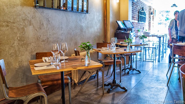
Our stay culminated in a gathering for a birthday meal at The Dairy on Clapham Common. Wow. What a treat that was! The food was exquisite. As we were a largish party, we had the tasting menu and every single dish was small but perfectly formed and served on the most beautiful, but heavy (the waiting staff must have muscles like rocks!) rivened stoneware plates/dishes. The Head Chef and Owner, Robin Gill, has quite a CV and it shows.
 
We began the evening at W & C (Wine and Charcuterie) on Clapham Common, the converted loos now a funky, busy bar underneath Clapham Common tube station. Very little has been done to the building....I guess apart from removing the urinals and giving it a darn good clean!! Our conversations on arrival centred around the rather unsavoury stories those walls could probably tell....disgraced MP's and the rest!


To list every shop we went in and every item I could have purchased would take another few pages, so I will pick my one favourite visit of the day....and one I've mentioned previously. If you want somewhere that has every little bit of kitchen gadgetry (husband satisfied) and all things decorative and functional for the kitchen/dining table then Divertimenti is definitely the shop to head to.


My exciting purchase of the visit......electric scales in the exact raspberry red of our Alessi Alessandro M corkscrew. I had to stop there. It was all getting too Rock and Roll......!!