Sunday, 29 April 2012

Two dressers. One inappropriately and one appropriately dressed.


Well. This delightful weather isn't letting up just yet. Mind you, I read in the weather forecast, that tomorrow should see temperatures around 18 degrees! Keeps us on our toes, I suppose.

This wild and windy weather didn't stop me and a friend braving our Sunday run at 8am this morning,  with hindsight, inappropriately dressed for the challenge. Strangely, other runners were conspicuous by their absence! Can't think why. I was positively drenched by the time I got home. I should really have posted a picture of my hair, both post run and once I had tried to tame it in the shower! Neither style was a good look. 'Wild' just about sums it up! I then had a conversation with my hub about mad hairstyles and he compared mine to Anita Dobson (Angie Watts hair), Brian May and Crystal Tipps! Great. Thanks for that!  

Raring to go, post run, I couldn't wait to re-assemble and dress a dresser which I have spent the weekend painting. My intention was to wait for better weather. I couldn't. It's not coming.

So. Here it is with before and after shots. I hope you like the result as much as I do.

I added a short string of bunting at the last minute, firstly because I thought it looked quite pretty, and secondly to showcase the bunting which was a recent Waitrose purchase. It's a 4m run of paper (card) bunting and is now on offer for £3.75 (down from £5). If you like bunting (I tend to stockpile it in a cupboard for parties etc), then order/buy some. It is such a pretty design.


Friday, 27 April 2012

Another rainy day!


Yet another rainy day! Whilst I actually find something quite relaxing about being indoors watching and listening to the rain outside, it is getting a bit much now! Even the quickest of trips to the supermarket involves wellies, raincoats and umbrellas. Exhausting! 

To add to this I was struck down with a 'bug' earlier in the week and so have been unable to function as normal! As my friend accurately observed, tummy bugs are one of the few things young children are willing to share!

As I have somewhat fallen short in the home interiors department this week, I thought I would post a picture of this beautiful jug, a present from my parents' recent France visit.

The perfect lift for these dull, wet, April days.

.....and the perfect excuse for my husband to go in to full 'Carry On' mode with endless references to "nice jugs!"

I hope it stops soon! Enough said!

Sunday, 22 April 2012

The long and short of painting furniture.


This weekend has been a busy one what with ferrying children to parties, supermarket visits and yesterday, squeezing in a bit of baking for friends who were coming round for supper. I managed to meet up with a friend for a run amidst the dashing around for a bit of piece and quiet, believe it or not!

Yesterday, between taking to and collecting from, a party I also managed to shoe horn in a spot of furniture painting. As my husband commented to friends later on that evening..."If it stays still too long in this house, it gets painted!"

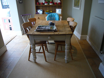
The object to succumb to my brush on this occasion was our kitchen table, a farmhouse table inherited from the previous owners of the property. All I did was paint the base to give it a little lift. I'm happy with the result. It feels like a new table. My excitement completely overshadowed the fact that I had painted the table within hours of our guests arriving for dinner!


Catching up later over supper, the subject of furniture painting arose. My husband delighted in the opportunity of being able to tell our friends how the paint on the table was not yet dry! (It was dry.....albeit it had that slightly tacky, not quite dry feel to it!) They laughed nervously before, with slight panic on their faces, moving their legs from under the table. Phew. No paint on trousers embarrassment!

We discussed painting techniques and I confessed to not always being as thorough as I should when it comes to preparation. (I have alluded to this in previous posts.) It depends on the object in question. If it is merely a decorative item, that serves no other function and therefore comes under no attack from trikes, bikes and any other abuse, then I often dispense with effort, wave sandpaper at it and paint two coats of top coat. If it is a large piece or something that I know will be bashed, moved, generally 'used and abused' then I do take a little more care. In this case I do knot, sand, prime and top coat.

The official line on painting furniture is to apply knotting solution where necessary, sand with a fine sandpaper, prime with water based primer and then add a suitable wood paint such as eggshell. (The 'long'.)

My summer project is going to be the dresser in the kitchen. For this I will almost certainly be turning to Annie Sloan paints. I have championed chalk paint before as it requires absolutely no preparation (The 'short'.) and comes in 24 delicious colours for furniture, floors and walls.


The other great thing about this paint is it is environmentally friendly being very low on VOC's. It can be used on all surfaces, inside and out and Annie's website shows you how you can mix colours together to create new shades.

Another effective way of using paint on furniture is to paint in one colour and then apply a second coat in an alternative colour and then gently sand back once dry so that the first colour slightly shows through over all or parts.

I may not be able to wait until the summer....


Friday, 20 April 2012

New look bedrooms for the kids


I am currently in the process of ageing-up the children's bedrooms. My son will be graduating from a cot into a single bed over the next few weeks. I have managed to put this off, despite coming under pressure from some of my contemporaries whose little darlings went from cot to bed at the age of something like 6 months, so they say!! That was once they had potty trained them at 3 weeks and taught them Latin of course.....!!

Frankly, I would have kept my 'little darling' in a cot until he managed to climb out were it not for the fact that he is getting too big for his sleeping bag and has outgrown every size of travel cot, so holidaying, visiting and staying anywhere where he has to sleep in a 'big boy's bed' is going to need some training!  

The other make-over involves my daughter's room, currently a pretty picture of pink-ness. Tasteful, but most definitely pink. Some while back she decided that blue was her favourite colour....about the same time as she discovered the delights of boy bands and horses....

Both rooms, thankfully, are painted white with neutral flooring, so the basics are there. I have started to peel off the border in my son's room, at which point I would urge any Mum-to-be....DON'T put up a border in the new nursery! At the time of decorating my son's nursery, I was new to nursery preparation. When I had my daughter we were leading a very transient life and knew we were moving within a few months so decorating a nursery was never part of the equation. By the time my son had arrived I was so excited that I went mad and bought everything...border, curtains, tie backs, blankets, toys....short of having my newborn tatooed with a gingerbread man, the room was well and truly 'themed'! I know. I really should have known better!

My daughter currently has a Cath Kidston pink polka dot duvet set which she loves. She is lucky in that she has a beautiful double bed and a kingsize quilt....downside....kingsize quilts cost!
I had a look around on line as she really wanted exactly the same but in blue. £60 for a duvet plus extra for pillow cases, plus delivery. That's quite a lot for an 8 year old!


What I found was a near identical set (Duvet and 2 pillow cases) from Yorkshire Linen.com for £18.99 plus delivery!

Now, admittedly, the above set is a polyester and cotton mix, whereas the Cath Kidston range is 100% cotton. I will compare the two on arrival and let you know the verdict.

Similar story for my son's room. The bedding sets below are from Yorkshire Linen and John Lewis respectively. Again, the John Lewis set, which I love, is 100% cotton and is £45 for the duvet and pillow case. The set below is £19.99 for duvet and pillow case, though having searched some more (after I'd ordered), it is available new on Ebay from £9.95! Again, I've ordered the Yorkshire Linen set. I don't think I will be accessorising with the matching elements, cushions etc. though. A tad over themed for my liking especially given that we live in the centre of the UK!

It remains to be seen whether the feel and quality of either of the two sets ordered will be compromised at these costs. Then again, children grow up and their tastes and likes change at such a rapid rate, that a little bit of polyester saving me a few pounds may be a compromise worth accepting! In any case, I need the extra for my White Company bedding! 


Sunday, 15 April 2012

SYmmetRY


I have a bit of an obsession with symmetry.  I like to arrange objects in a symmetrical fashion and get a bit twitchy if something is slightly out of place! (I know....a bit 'Sleeping with the enemy'...) I recall watching a design programme once where a house had been renovated, however the owner was not happy with the positioning of a spot light above the bath. The symmetry was not quite right. It bothered the owner when in the bath looking up at the light, so much so, the electrician was brought back in to re-align the light fitting. It would have driven me bananas too even though it was only a fraction out of line. 
Fortunately, symmetry is a trick of the trade used by interior stylists to achieve timeless, classic styles when positioning objects on shelves and mantelpieces or just positioning treasured items around the home. Perfect! I can indulge my obsession under the guise of design!

On a shelf or mantel, position items in a straight row, such as candlesticks, with one at either end. To add a little more depth, position two urns or two lanterns, for example, next to each other in the centre. You can see, my mantelpiece has this balanced arrangement as the main focus and then a couple of additional smaller items to slightly break up the uniformity.

For a more casual symmetry, select medium sized items for display. The objects should resemble each other in some way....be along the same theme....but should not match. There should still be a balance to the arrangement....but not necessarily a strict symmetry. Some refer to this as 'balanced asymmetry'.


All vignettes, whether on a table or a shelf, need to have highs and lows. Place medium sized pieces at one end, for example, and then balance with a single large piece at the other end.


Symmetry and/or balance is pleasing to the eye and is why most will order objects with this in mind.


Thursday, 12 April 2012

The waking garden.


I particularly like this time of year in the garden. Especially early in the morning when everything has that dewy freshness about it. I was out at 7am this morning taking these photographs of my garden. My 2 year old was happily reading his Fireman Sam book in the conservatory, the 8 year old was fast asleep and hub was at his desk so it was the perfect opportunity for me to creep out into the garden in my pj's and slippers and take a few snaps! Oh, the glamour!

At this time of year, the garden seems to be slowly waking up from a deep sleep. I can almost see the perennials yawning and stretching their way out of the ground as their green leaved summer outfits start to make an appearance. The Clematis 'Elsa Spath' is showing promising signs...lots of early growth. The Alpines and the primroses are in flower already, adding a bit of spring excitement to an otherwise still quite sleepy garden. The garden furniture will soon come out of hibernation along with the Chimenea for that late evening warmth during the BBQ season. To me, it is a very optimistic time of year.


Now is the time when I start to consider exteriors as well as interiors.....replacing any frost damaged pots and planters and getting a few ideas for what to plant. The kids like to get involved, to varying degrees, and so I let them choose a pot or two in which they can sow some seeds or plant some herbs. 

Here are some planter examples for adults and children alike. The tea cup and saucer planter might be an excellent and fun way of encouraging and getting children involved in gardening.


Botanico tea cup and saucer
£19.99 Greenfingers. 


Galvanised herb pots £1.80 each
 
Zinc oval planters £19.99 for 2
http://www.greenfingers.com/
  
Galvanised planters
 £44.50 for 3
http://www.countryandvintage.co.uk/


Large window planter £47.50
http://www.gardentrading.co.uk/


Cascade planter £89.99
 
 
Bamburgh herb planter £49.99
http://www.greatlittlegarden.co.uk/


Tuesday, 10 April 2012

Choc-horror!


This, not insignificant bounty, (excuse the pun) of confectionery belongs to my own two very delighted Easter chicks! It equates to around two thirds of the total hoard. Unfortunately,  for my children's teeth at least, we have quite a large extended family! At least it has a good shelf life. I will squirrel this lot away and drip feed it over the coming year or so!! I seem to remember being happy with one egg!

When we bought this house we inherited some rather nice but rather rickety old chairs. In my book, 'rickety' is a good thing. Character, history, 'shabby chic' as perhaps some would call it. In my husband's book, it means belonging in the skip or chopped up for fire wood ideally! 

I would argue, and do, frequently, that our house lends itself well to old bits of furniture....the tattier the better. As long as I can see some potential....a mini makeover.....then it will always have a home, even if we don't need it. I can't throw chairs away. We have ten or eleven dining chairs stashed away or dotted around the house and they all come out at Christmas, birthdays, dinner parties etc. They are needed!

A particularly rickety example has had a mini makeover, a kind of 10 Years Younger for the furniture world, today. Once her legs have been glued back in place, she will be a new woman!

Rather than all one colour, I have paired Elephant's Breath (F&B) with Mulberry (Homebase 'Sanctuary' range). I bought tester pots for both colours. Furniture painting purists would tell me off for using matt emulsion on woodwork. It will bash and show the wood underneath far quicker than 'wood paint' but I'm not bothered about that. Tester pots are a fraction of the cost and good enough for one off jobs here and there. The Mulberry tester pot has covered one whole chair (2 coats) and this one, so a pretty cost effective makeover. I can touch up the odd bash as and when.

There's life in this old chair yet!


Monday, 9 April 2012

Iconic design and another cake thrown in!

Yesterday was an indoors kind of day....as was much of the weekend. I spent a large part of Friday and Saturday, as usual, with a paint brush in my hand, tidying up the walls in the kitchen, conservatory and playroom. It was a very therapeutic task. The lower walls were showing tell tale signs....finger prints and scuff marks... of small children racing around the house with abandon, on trikes and hobby horses! In more than one place our son had penned his 'tag' in white board pen. Every now and then I have a blitz and clean up their acts!

Our daughter arrived back from her ski-ing trip yesterday. Phew! I'm always relieved when she is back, especially when she then regales me with stories of black runs and ski-ing directly under the lifts!! She is 8! Ignorance is most definitely bliss...on my part, that is!

Anyway. We have a family gathering today and so, not for the first time over the past couple of weeks, we made a cake! I thought we'd make a cake rather than buying individual eggs for nieces and nephews, who, on the whole, are old enough now to forsake chocolate eggs. (I have decided! Maybe I should have consulted them first....)


Whilst I was baking the cake I was listening to the radio and a discussion about the Union Jack as an iconic design. I'm surprised the cake turned out ok because it was a really interesting discussion and my attention was definitely more toward the radio than the cake mix. There was lots of debate about the over use of the flag in design and whether the contributors felt that, once the Jubilee and the Olympics were over, whether our passion for the flag would still remain. Opinion was mixed. The discussion centred around the negative connotations of the flag...the Empire, racism, the questionable use as 'inappropriate' symbolism in popular culture, that sort of thing. The positives were the flag representing national unity...though there was some debate about whether it was actually a fair representation of 'unity'... 'should the Welsh Dragon be incorporated?' being one of the many questions. 

Apparently supermarkets have fast run low on stocks of any of their Union Jack branded items....paper plates, napkins, bunting, bun cases, red and blue food colouring...the list is endless. Rather sadly (possibly), I did buy the last 2 packs of bun cases on the supermarket shelf that day, just in case! Maybe I can flog them on Ebay...

When it came to the use of the flag as a design statement, the discussion was, in my view, surprisingly lacking. Everyone agreed that it was a good design. The architect, George Clarke, is a fan, and commented that he felt the flag fad would see beyond the Jubilee and the games because of its popularity in interior accessories, think Vivienne Westwood wall hangings, Jan Constantine cushions etc.

I share this view. I actually don't look at the design as a symbol of national identity to be honest. Discussing it with my husband, he took the opposite view. He appreciates the design element, but does not like the negative associations...what he believes is often misplaced/misused national pride etc. I just think, simple and straightforward, that it is a good piece of design...a great combination of colour and shapes rather than a pledge to Queen and Country, in the same way that, as a design statement, I love the stars and stripes flag....Ralph Lauren, Lexington etc. As a design, it is bold yet simple and makes the perfect accessory. Yes. It can be over done, but the odd nod to it here and there looks great!

In the absence of a budget permitting Ralph Lauren, I look to Emma Bridgewater and Lexington for my hits. The jug below is Bridgewater, a present from a good friend. The tray was £8.00 from John Lewis, or log directly onto the Emma Bridgewater website for a host of Union Jack themed accessories. I also have a tea caddy (£8). Just enough to not make the house look like collectors corner! The throw is Ralph Lauren and the cushion, Lexington £39. See also Jan Constantine and Vivienne Westwood.


Cole and Son Union Jack wallpaper by Vivienne Westwood £139 at  Heal's


Emma Bridgewater from £8.00
http://www.emmabridgewater.co.uk/

Ralph Lauren throw £225 
http://www.ralphlauren.co.uk/

Lexington cushion £39
http://www.amara.co.uk/


I hope you have all had a great Easter!


Friday, 6 April 2012

Mellow yellow. Using yellow in Interior Design.


Yellow is the subject of today's blog. Yellow is very much 'on trend' in both the fashion and interiors worlds. It is a strange one, in my view. I have never been a fan of yellow. I look awful in anything yellow. I am fair skinned and freckled, two attributes that do not lend themselves to reds or yellows. Some years ago I bought a yellowy, mustardy coloured skirt from Laura Ashley. I wore it once, I think. I never dared wear it. Silly really because when I look back, with the black tights and black jumper it was worn with, it did actually look pretty funky. It was quite daring for me at the time, though. Not something I was/am known for  and I think therein lies the problem with bright colours. They need to be treated with care and used appropriately. Only the bold can carry large blocks of yellow in clothing. At this point, if you are interested in yellow from the fashion perspective, I would direct you to http://www.styleguile.blogspot.com/. Beth Goodrham dedicates posts to wearing yellow and explains the rules far more professionally than I ever could.

In terms of interior design, yellow evokes feelings of warmth and happiness. A tick in the box for yellow! Like red, yellow supposedly speeds up the metabolism. The theory goes that many fast food restaurants use reds and yellows in their colour schemes as they stimulate hunger and thus make diners buy more food.

On the negative side, yellow stimulates the 'caution' sensor in our brain. It grabs the attention. Psychological studies have shown that too much yellow hurts the eye and agitates people. Brightly coloured walls cause feelings of turmoil and hostility. Dark yellow hues are thought to provoke nausea! As a result, many designers avoid using yellow in the bedroom. Hostility, turmoil and nausea are not words that one ordinarily associates with the bedroom, after all........not unless your other half has been out with the gang on a Friday night for a beer and a curry at least!!! 

 Yellow, in interior designs, should really be used in moderation. Whilst I have seen some fabulous interior images with yellow completely taking over the design, it is a bold statement and a real commitment to the colour. Rather, yellow is best used as an accent colour as can be seen in the schemes here.

 Used strategically, it can brighten up a room or emphasise positives. Accents of yellow add a 'kick' to a room, livening up a scheme.

Choosing the right shade of yellow can be tricky. A very bright yellow is more suited to a bright, light space whereas, if, like me, your rooms are slightly dark, then a more mustardy tone is better suited. The pic below, many of you will recognise as being my front room. The walls are painted in Farrow and Ball's Stony Ground. This is quite a definite colour, not dark, but 'definite'. As the sun (when it is around!) moves to the back of my house, this room becomes quite dull. I chop and change my view about whether dark rooms should be painted in light colours to give the illusion of light...or whether one should just work with nature and go with a darker colour. Farrow and Ball suggest the latter is the way to go and I have to say that I agree, having painted this room more times than I care to mention!

The idea for yellow tones as an accent came from the picture above the sofa. Citrus shades work well with earthy tones in that they liven what could otherwise be a flat scheme and I think it works here. I've picked up the yellow in the picture and accessorised with a sulphur coloured cushion from John Lewis (£35). (My husband is not keen. He says it reminds him of a hat his Grandmother used to wear!) The navy velvet cushions are also John Lewis and the Ikat design 'Kamasi' cushion covers are from Oka (£39). Blues and yellows, opposite each other on the colour wheel, compliment each other nicely.


 I'm on the look out for another cushion for the other sofa now. Same accent colour again.  This is just enough yellow for me. Enough that I can re visit if I get agitated, hostile or nauseous at any point!
Anyway. I hope this gives you some confidence to give yellow a go.


Monday, 2 April 2012

A tree for Easter.


I decided to decorate our Easter tree today. This statement makes it sound like I decorate an Easter tree every year. Actually, this year will be the first! I have thought about doing it before, but the thought has never moved from being just an idea. This year I thought I would indugle in a bit of Easter-ousness (a new word!) and give it a go.

Decorating Easter trees is another festive holiday custom that traces its roots back to Germany.

The traditional "trees" were branches in a vase hung with brightly coloured eggs. Today many homes hang the painted or dyed Easter eggs and other decorations on real trees in their front yards to add a colourful touch and a festive spirit to the whole neighbourhood.

A variation on the Easter tree tradition takes its inspiration from the Bible, with families creating ornaments based on scripture, starting with Genesis and ending with the Resurrection.

During Lent, one ornament per day is added for the 40 days of Lent, or just one per week until holy week when an egg is added counting down to Easter. The ornaments are usually hand made as kids help to decide what Biblical symbols would make appropriate decorations for the Easter tree.

As I am not organised enough for the 40 days of lent, my tree is going up with only days to spare, though I do like to find out about the traditions behind these things.

This branch is actually my Christmas branch. This is an idea I pinched from my Mum, who, at Christmas, always paints a branch onto which she dangles all manner of sparkly, shiny, twinkly baubles and pretty lights. Naturally, I stole her idea and made it my own! Mine was slightly bigger, spray painted chrome silver rather than white and bedecked with a handful of big, fat juicy baubles and twinkly white lights. I preferred it to the main tree in the end.  If you have the time and can find a decent shaped branch from somewhere then I urge you to do this at Christmas. The effect is really something and a bit different from the norm.

Onto the Easter tree. I re wrapped the base (a solid, heavy chunk of railway sleeper) with pink spotty paper and secured the branch. The eggs (shown below) are from Dibor and cost £5.95 for 10. Try http://www.giftsfromhandpicked.com/ as an alternative. You will find a whole range of Easter decorations here.....lots of lovely Gisela Graham bits and bobs.

The other decorations are from a range of local gift shops, but include small white wooden geese, card gift tags, hole-punched and threaded with blue gingham ribbon and pink and blue wooden spotty hearts. I am going to add some easter chicks at some point....but just haven't got round to that yet. Lights are an option, but I think I am going to leave it as it is.

If you get in quick, you may still have time to decorate a tree before the weekend! Happy Easter! x